
Do you love polls? We sure do! We’ve been looking into polls here at RumbleTalk. And, we think they’re a great way to get a sense of what people are thinking. But how do you display results? Well, we have three new ways to show poll results: word cloud, pie chart, and vertical chart/bar graph.
Each one offers a different method of displaying which party is winning by showing how many people on each side voted in each subsection of the poll question.
Visualize words in various colors and sizes
Word cloud is a visualization of word frequency. It is a way to visualize which words are most frequently used in a text, such as an article or blog post. This type of poll result can be used for many purposes, including analyzing social media posts and blog posts and spotting trends in language use.
Here’s how it works: you use polls to gather the answers of your audience. Then, each time someone selects an answer from the choices, it gets added to your word cloud! You’ll see at once which answers were most commonly chosen throughout the whole poll without having to go through every single answer individually.
This makes it easy for readers who might not be that interested in answering the poll but still want the answers to come up quickly.
Percentages in pies
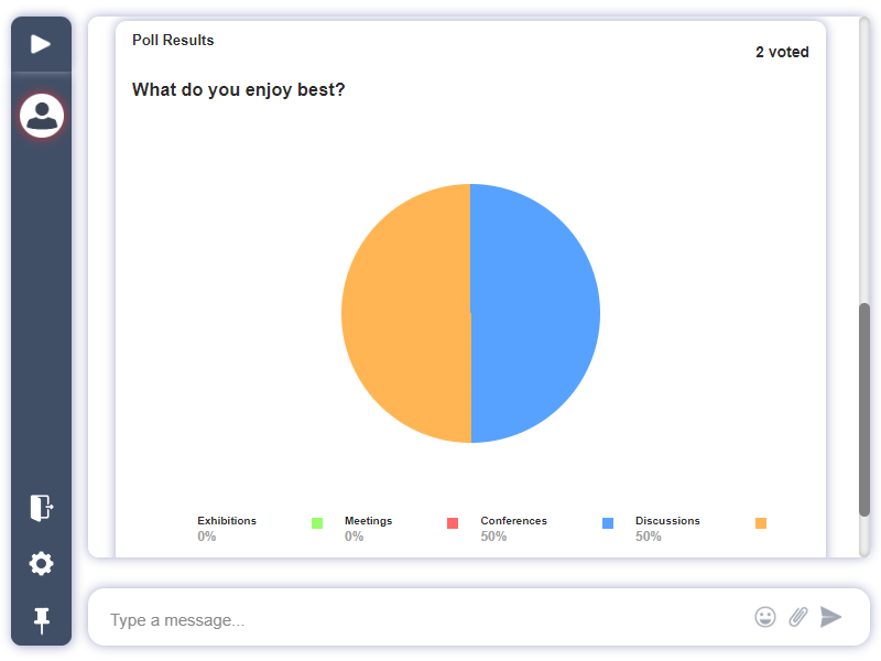
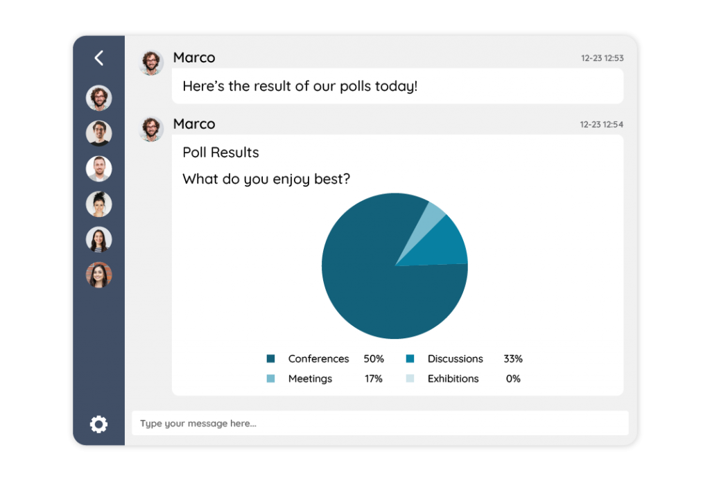
Pie charts represent percentages. They are also known as bar graphs and pie-diagrams. In a pie chart, one part of the data is represented by an area divided into wedge-shaped sectors proportional to the size of that part. The total number is represented by the size of one sector, while each piece represents a fractional portion of it.
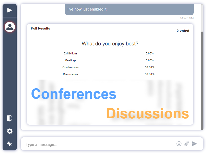
For example: If you have people in your chat room who responded to your question about whether they like conferences or discussions, you would use a pie chart like this:
Charts or bar graphs
A bar graph is a type of graphic that shows information in a vertical format. It can be used to display poll results as well. However, you have to make sure you’re using the correct tool for the job.
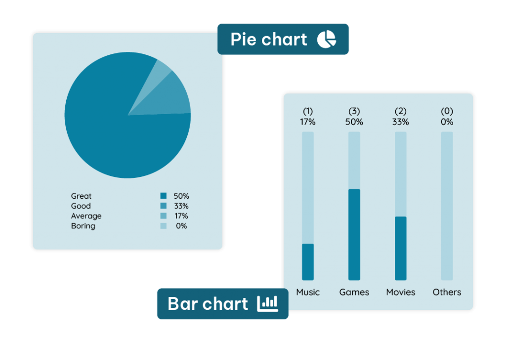
If you want your audience members’ eyes drawn right toward your bar graphs without having them distracted by extraneous elements like text labels or arrows pointing outwards from the center point of interest—which might happen if someone were looking at something else while checking out some polling data—then it’s best practice to use vertical charts such as this.
Three engaging ways to display poll results
We hope you’ve enjoyed this introduction to the 3 new ways RumbleTalk can display poll results. To summarize, the new ways to display poll results are:
- Word cloud
- Pie chart
- Vertical chart/bar graph
To know more about how to display poll results, then refer to this KB article: Who can see the answers in polls?
In the future, we’ll be releasing more examples of these and how they can be used effectively in your chat. Please reach out to us at support@rumbletalk.com with any questions or comments!