Type of chat polls for Q&A
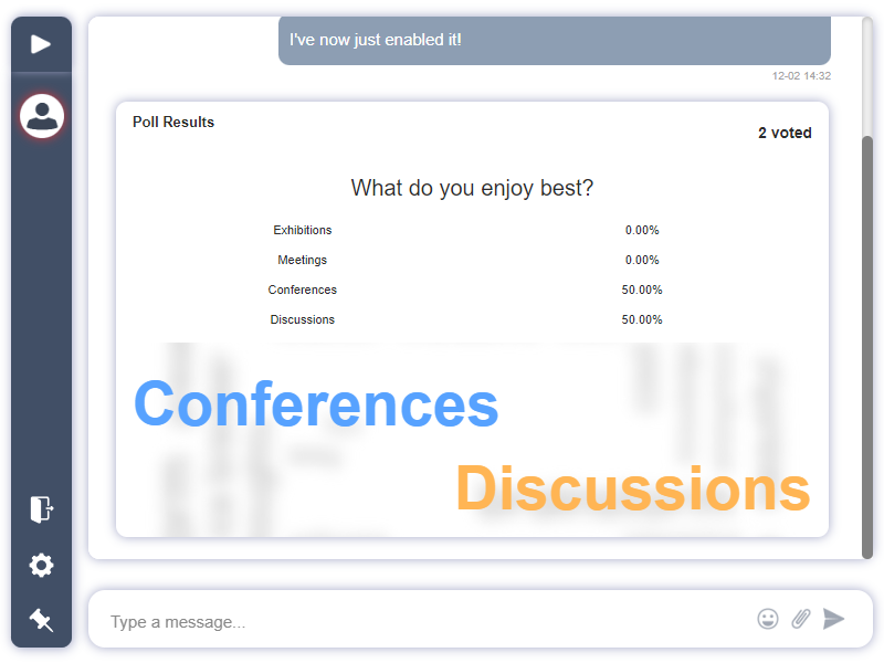
RumbleTalk offers multiple ways to visualize chat polls results, making it easier to engage your audience and present data in a meaningful way. You can choose to display the results in Word Cloud, Pie Chart, or Bar/Graph.
1. Chat polls – Word Cloud
A Word Cloud is a visually engaging way to display chat polls results, especially when your poll includes open-ended questions or multiple-choice options. In a Word Cloud, the most frequent words or responses appear larger, giving an instant visual representation of the most popular answers.
Key Features:
- Visual Priority: The more frequent an answer, the larger it appears in the cloud.
- Engagement Boost: Word clouds are interactive and catch the attention of participants due to their dynamic visual nature.
Best Use Case:
- Open-ended Polls: When users provide text-based responses, word clouds make it easy to see which words or phrases are most common.
- Quick Insights: Ideal for situations where you want to quickly gauge the overall sentiment or popular opinions.
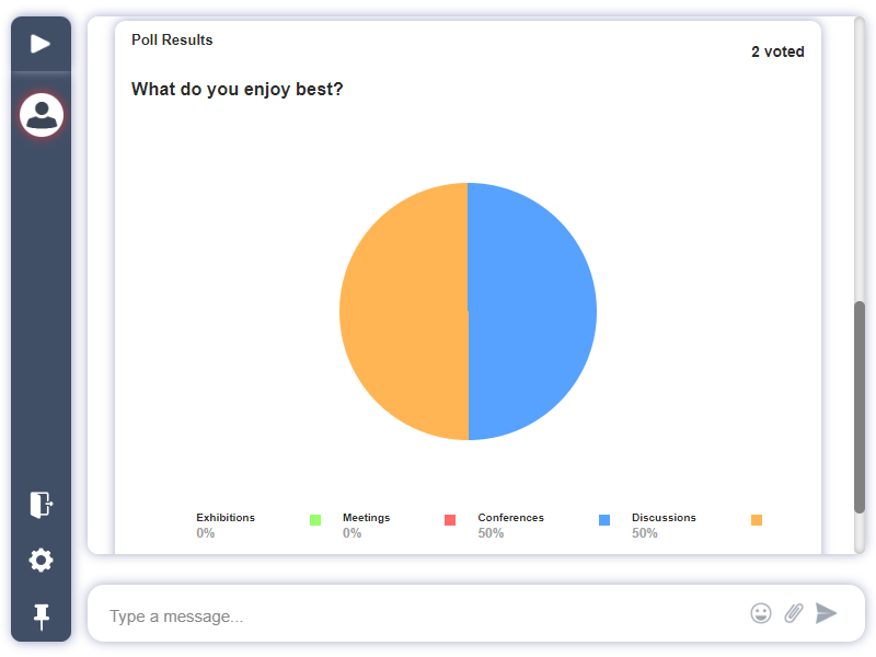
2. Pie Chart
Pie charts provide a clear, straightforward breakdown of chat polls results, showing the percentage of votes for each option. This is particularly useful for polls with a limited number of options, where you want to highlight the distribution of votes across all choices.
Key Features:
- Visual Clarity: Each section of the pie represents a portion of the total votes, making it easy to understand which options are most and least popular.
- Simple Breakdown: The percentages for each response are displayed within the pie chart, giving users immediate insights.
Best Use Case:
- Yes/No Polls or Multiple Choice: Pie charts work best when the poll has 2-4 options, providing a clear and concise breakdown of how the audience responded.
- Presenting Data to Decision-Makers: For situations where you need to display concrete numbers and percentages in an easy-to-read format.
3. Chat polls Bar/Graph
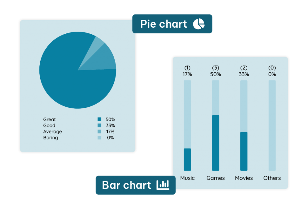
Bar charts or graphs are another effective way to visualize chat polls results, especially when dealing with a larger set of options. This format allows for easy comparison of results, making it clear which options are the most or least favored.
Key Features:
- Comparative Visualization: The length of each bar corresponds to the number of votes each option received, providing a direct comparison between options.
- Easy to Read: Bar graphs work well for polls with numerous response options, as they clearly display which option has the highest and lowest support.
Best Use Case:
- Polls with Many Options: When you have more than three options, a bar chart makes it easier to compare the results.
- Detailed Data Analysis: Ideal when presenting results that require in-depth analysis or comparison between a variety of answers.


